My role
I worked on the adaption of the logo, creating a simple and uncomplicated design which retained recognisable elements of the brand’s existing identity yet was flexible enough to be used across all signage and POS.
The brand guidelines I created not only showed the updated look and feel for Welcome Break but how, in detail, this should be used across the Welcome Break estate. The Brand Manual was born! Each design element from signage, customer communication points and how these should look, the standards that are to be maintained as well as how to order new products. This is a constantly evolving guide which is used across the whole business.

A simple, uncomplicated logo which retains recognisable elements of the brand’s existing identity, yet is flexible enough to be used across all signage and POS

The Brand Manual needed to cover all touch points of the business from brand usage across print and digital platforms, external and internal signage as well as a guide on how to present areas across the building.
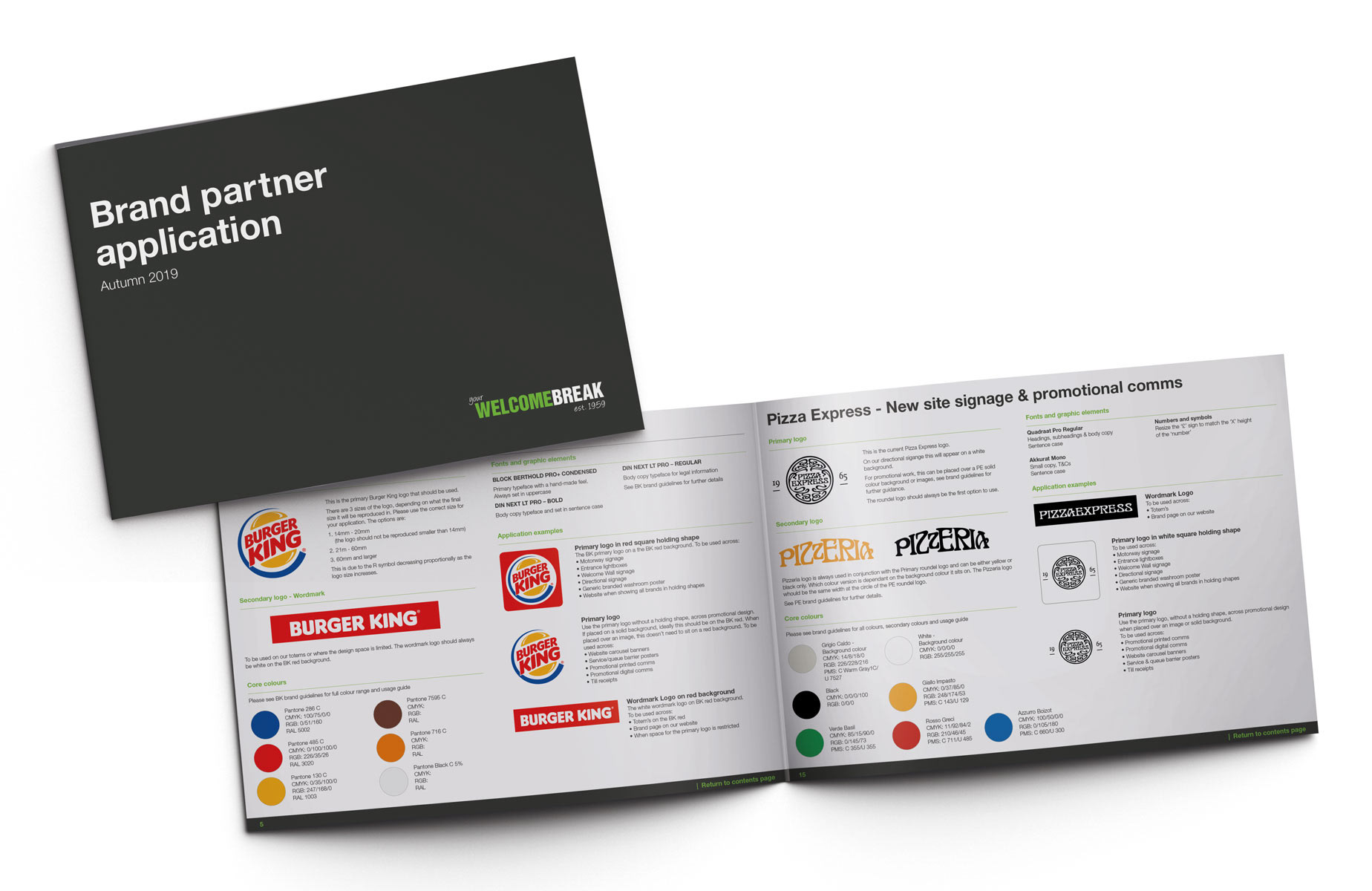
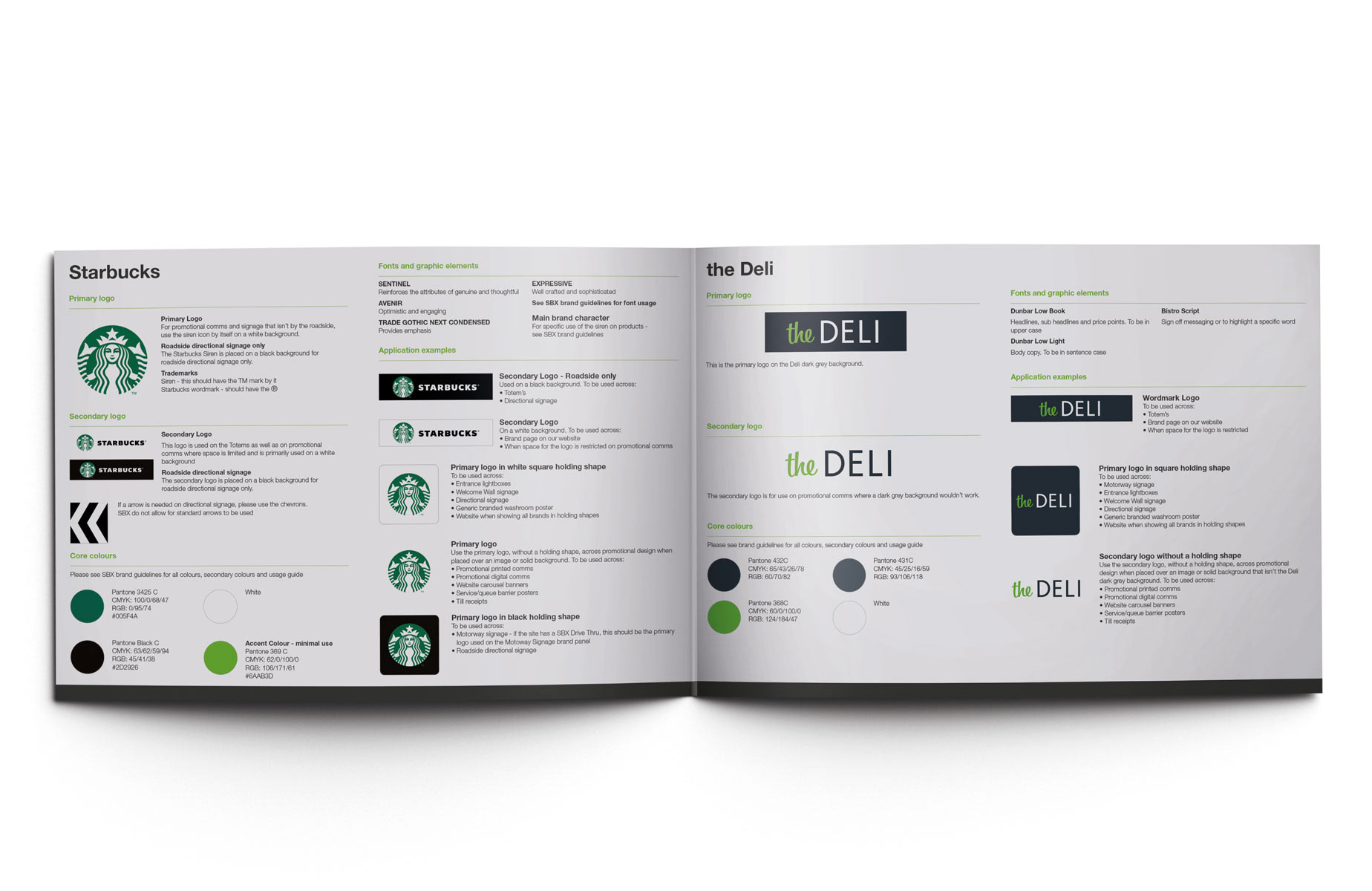
Welcome Break has 12+ franchise partners. To ensure each partner's branding was applied consistently and inline with their guidelines, I created a Brand Partner application bible which set out how we use each partner's branding across different applications.